2017 Galleries
The Spark Gallery pages are one of our most popular design destinations, with thousands of visitors each year. Check out some of the latest Spark entries, in the galleries below.
Galleries // 2017 Spark:Communication // Atomy Product Identity
Atomy Product Identity
Winner - Bronze
Competition: Spark:Communication
Designer: Seung Ki Kim - Team manager
Design Type: Corporate Identity
Company / Organization / School: Atomu Co., LTD
Team Members: Wie Jin, Woong Jae Lee, Hae Seung Lee & In Jung Jo
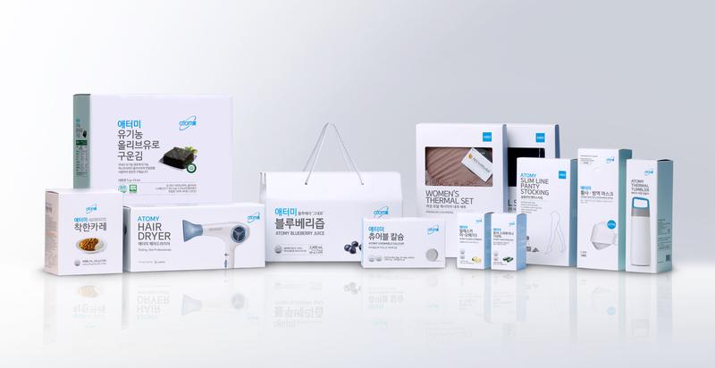
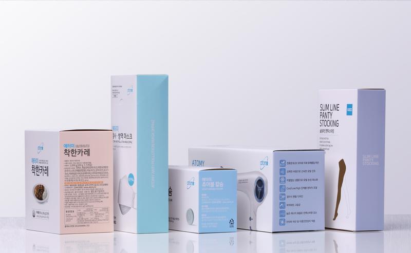
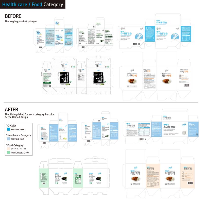
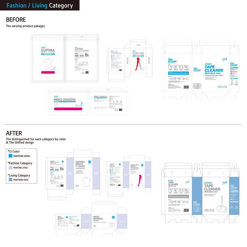
For the packages of Atomy’s products, the company’s identity colors were used to embody the spirit and philosophy unique to Atomy. The blue color symbolizes the spirit of Atomy, a people-oriented company that wishes for its customers’ success, as well as the hopes for the future, while the white color represents purity and embodies Atomy’s will toward transparency, honesty and integrity. A uniform design was created to replace the varying product packages, thereby maintaining a consistent tone and manner for the entire product lines of Atomy and enhancing brand recognition among consumers. In addition, an exclusive font (Atomy-font) we’ve developed independently has been applied to all packages as a way to ensure that our brand identity can be readily recognized and to differentiate our brand from others. The product packages of Atomy have been distinguished for each category by color, which is shown on the side for customers to intuitively distinguish each product by its product category.