2019 Galleries
The Spark Gallery pages are one of our most popular design destinations, with thousands of visitors each year. Check out some of the latest Spark entries, in the galleries below.
Galleries // 2019 Spark:Fall/Winter Student // OBANG STORE Branding & Packaging
OBANG STORE Branding & Packaging
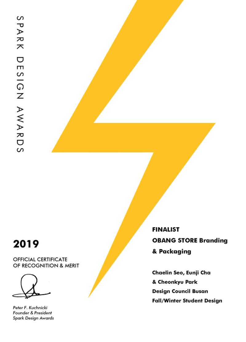
Finalist
Competition: Spark:Fall/Winter Student
Designer: Chaelin Seo
Design Type: Brand: Logos, communications, Packaging
Company / Organization / School: Design Council Busan
Team Members: Chaelin Seo, Eunji Cha & Cheonkyu Park
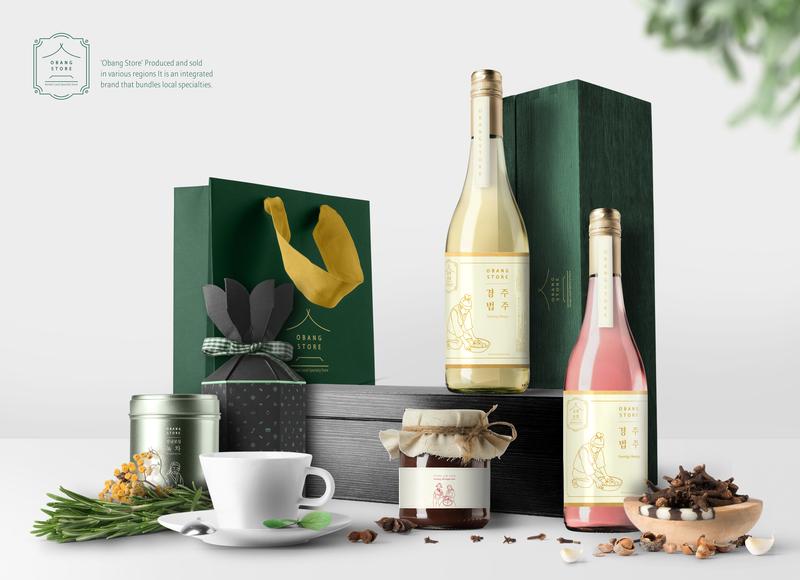
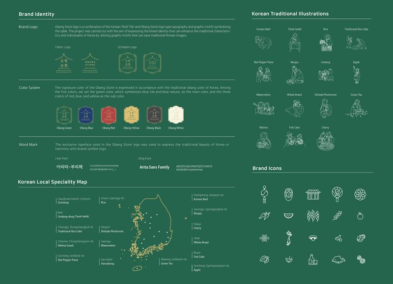
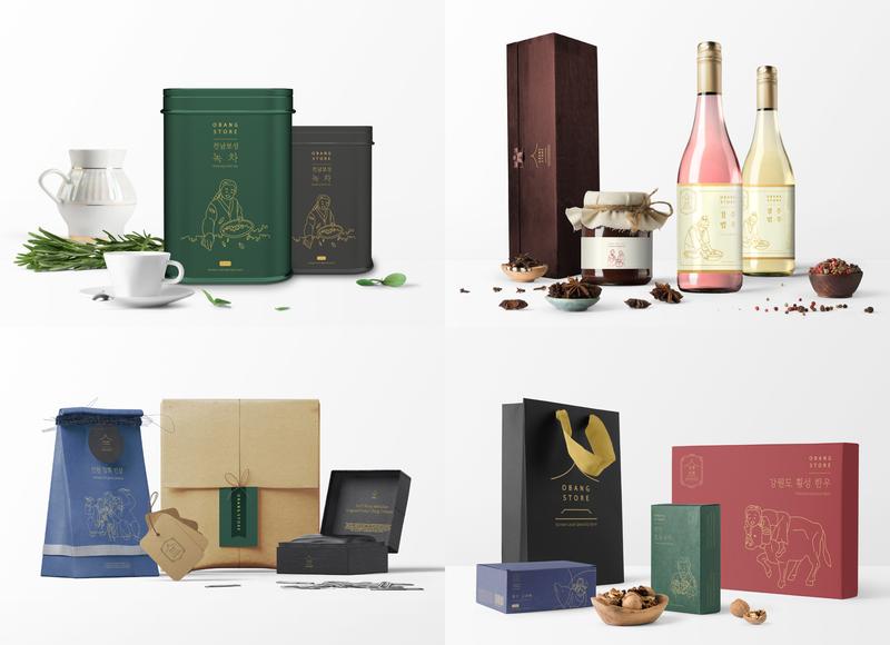
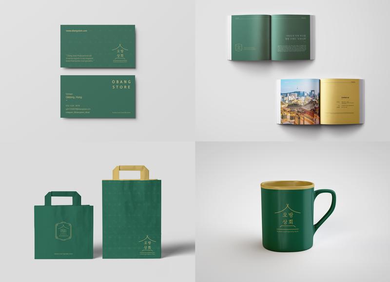
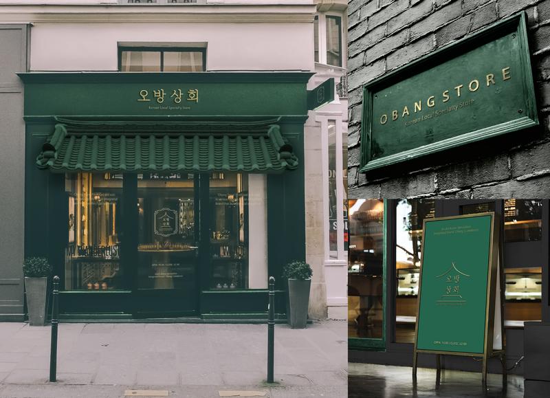
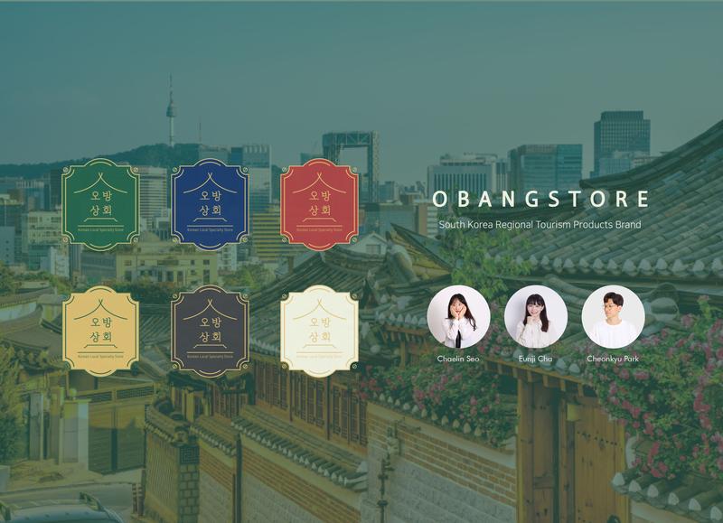
'OBANG STORE' is an integrated brand that groups regional specialties produced and sold in various parts of Korea. Obang Store a brand name in Korean means that it offers 'a Excellent collection of products produced and sold in Korea's entire. The goal of the Obang Store Project is to select foreigners who visit and travel Korea as their main target, and to ensure that outstanding products in areas where they have not been or are not able to visit Korea can be introduced as fresh and excellent products in one brand, one pop-up store. Obang Store logo is expressed in Korean 'Giwa Roof' and the graphic motifs symbolizing the table, and the signature color is expressed in accordance with the traditional obang color of Korea. With 'Obang' color as the base, the green color symbolizing blue 'Giwa' and green nature was set as the main color, and the color of red, blue, and yellow was set as the sub color. The exclusive typeface used in the Obang Store logo was used to express the traditional beauty of Korea while harmonizing with symbol. In this way, we expressed identity to save the traditional Individuality of Korea.

