2021 Galleries
The Spark Gallery pages are one of our most popular design destinations, with thousands of visitors each year. Check out some of the latest Spark entries, in the galleries below.
Galleries // 2021 Spark:Graphic // Keumyoung CI Design
Keumyoung CI Design
Finalist
Competition: Spark:Graphic
Designer: Yunwoo Jeong - Prof.
Design Type: Brand Identity, logos
Company / Organization / School: UNIST / Disegno T9
Team Members: Jinhee Cha, Ga-eul Han, Wooin Jang, Minji Kim, Choeun Park & Prof. Yunwoo Jeong
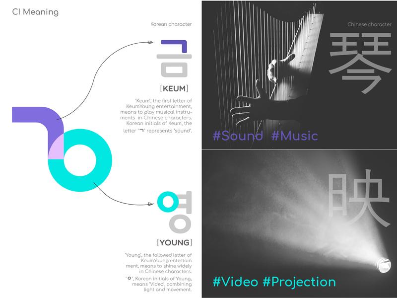
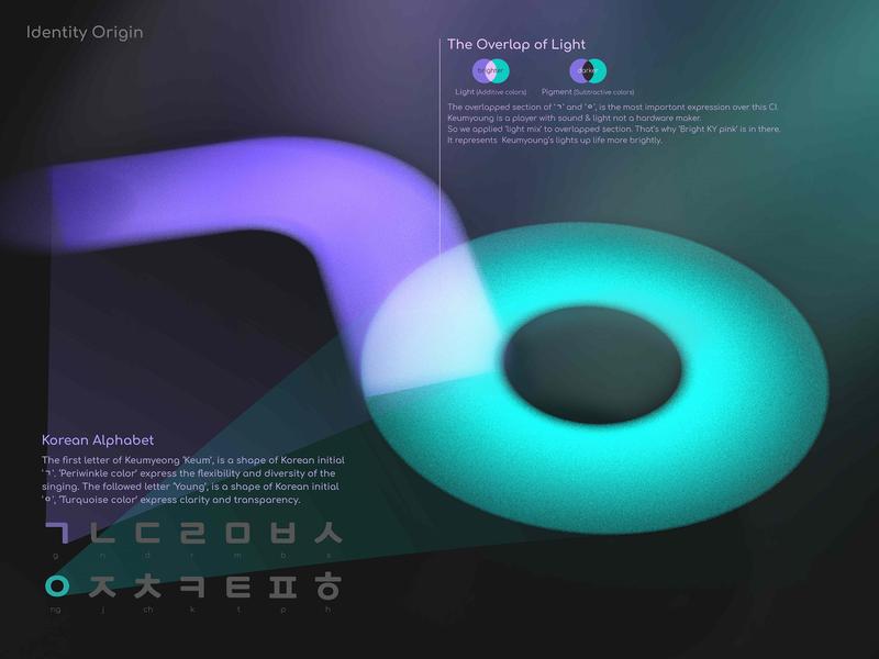
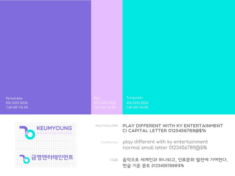
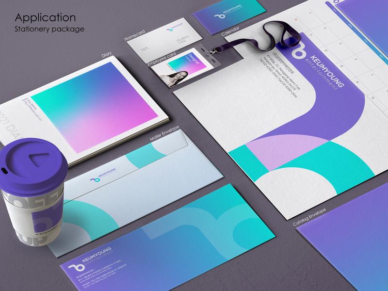
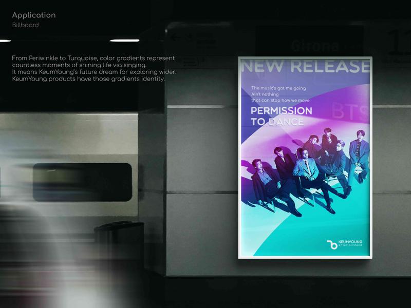
Keumyoung Entertainment is Korea's No.1 karaoke company. Keumyoung changed CI to stretch itself as a unique entertainment group through sound and light with karaoke. Keumyoung is different from other music companies that simply broker, sell music sources. In our lifetime, we always sing. Happy moments, even in sad and angry, we are singing. Thus, Keumyoung makes us sing all the happy, sad, angry, and joyful moments. New CI expresses the philosophy, illuminating beautiful moments of our lives through singing. The first letter ‘Keum’ means playing instruments. As a shape of Korean initial '?', Periwinkle color expresses the flexibility, diversity of singing. The followed ‘Young’ means shining light as a shape of Korean initial '?', Turquoise color expresses clarity, transparency. The overlapped section is the most important expression over this CI. Unlike physical objects overlapped, Where lights are mixed, it becomes brighter. Keumyoung is a player with sound&light. So we applied ‘Bright KYpink’ as a light mix, representing lights up life more brightly. From Periwinkle to Turquoise, the gradients represent countless moments of shining life via singing. Business cards, letters, signboards have those gradients. It is a huge exchange of emotions over a lifetime.