2013 Galleries
The Spark Gallery pages are one of our most popular design destinations, with thousands of visitors each year. Check out some of the latest Spark entries, in the galleries below.
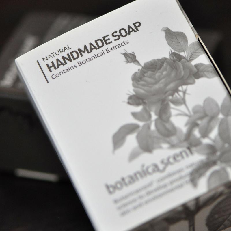
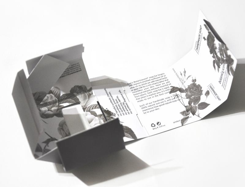
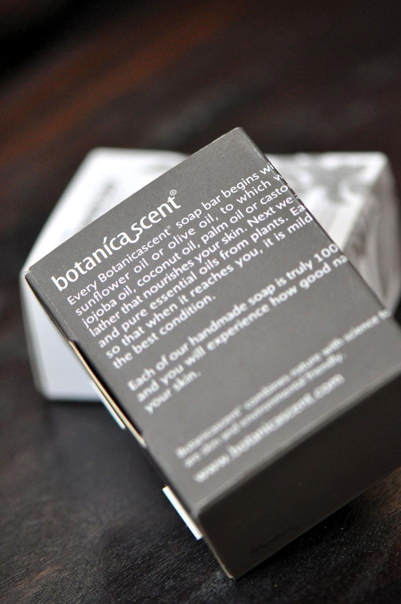
Galleries // 2013 Spark:Communication // Botanicascent Reversible Soap Packaging
Botanicascent Reversible Soap Packaging
Winner - Bronze
Competition: Spark:Communication
Designer: Ms. Jesvin Yeo - Creative Director
Design Type: Packaging Design
Company / Organization / School: Nanyang Technological University
Website: https://www.designingculturesstudio.com/
Botanicascent is a new skin and hair care brand that promotes sustainable living within Singapore community. The objective of this project is to create a cost effective, unique and eye-catching packaging design that stand out from the Singapore competitors. Based on Singapore market research, most competitors’ products are designed using full colours and colour images. Therefore this design is focuses on SIMPLE: Single color; Illustration; Minimalism; Primitive; Locally made; Easy to construct. The packaging of Botanicascent experiments with colour of black and negative spaces to build its brand awareness. It does away with the typical soft colour palette and italic typeface to challenge the saying that the colours black and white are not suitable for woman’s products, especially skin and hair care products. The move toward a simple communication style is reflected in the use of white space, bold line drawings and sans-serif type, while handwriting type gives a personalized touch. Intent on reducing the cost of papers and printing, this soap packaging was designed in a way that it can be used for two different kinds of soap bars – the handmade and the organic. Using only folding, no glue, and one colour printing, the beauty of the packaging lies in how a flat piece of material can turns into a floral illustration box with a rolling movement and interlock, as well as reversible to form a solid-coloured packaging for the organic soap bar.