2020 Galleries
The Spark Gallery pages are one of our most popular design destinations, with thousands of visitors each year. Check out some of the latest Spark entries, in the galleries below.
Galleries // 2020 Spark:Spring Student // OROT
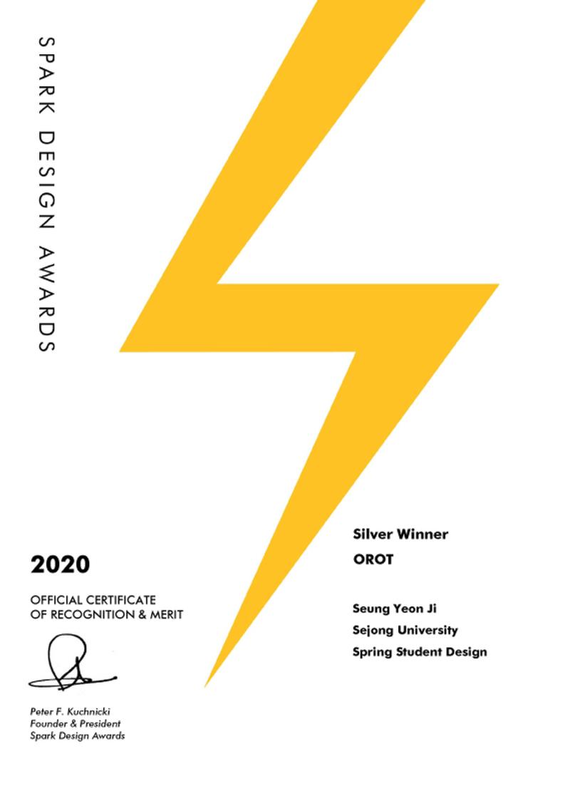
OROT
Winner - Silver
Competition: Spark:Spring Student
Designer: Seung Yeon Ji
Design Type: Packaging
Company / Organization / School: Sejong University
Team Members: Seung Yeon Ji
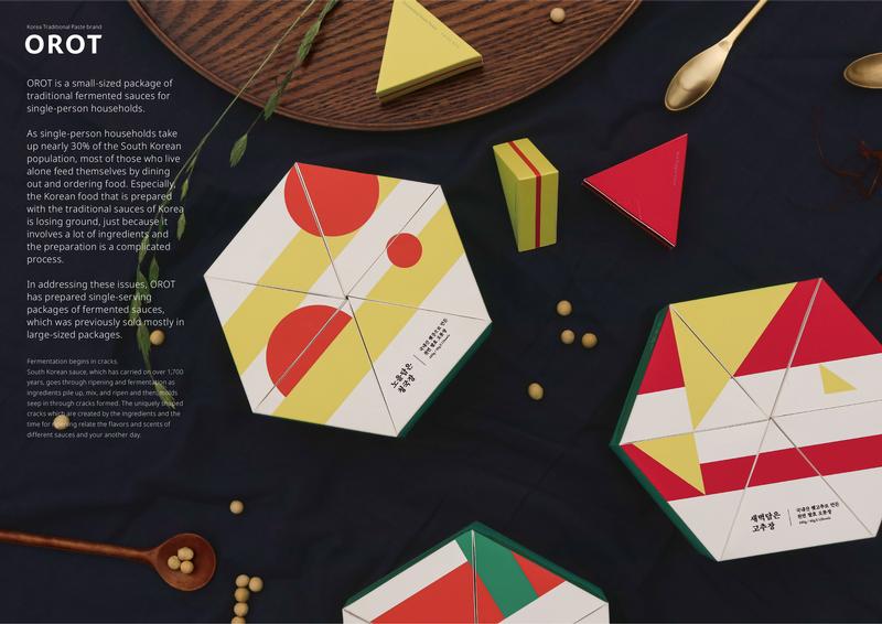
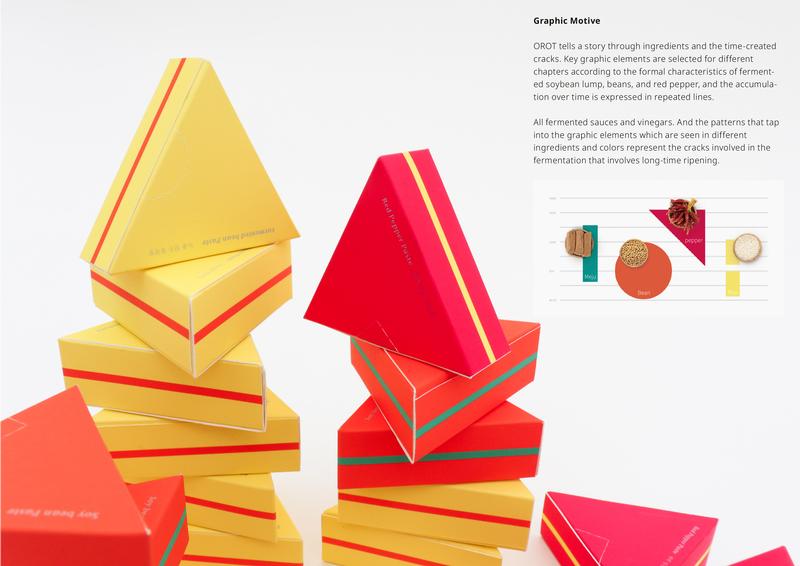
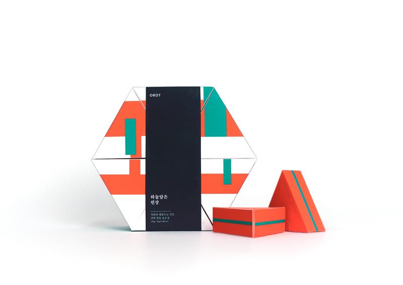
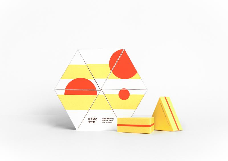
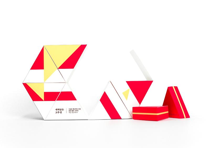
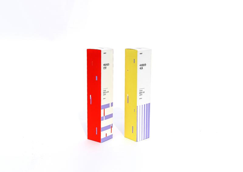
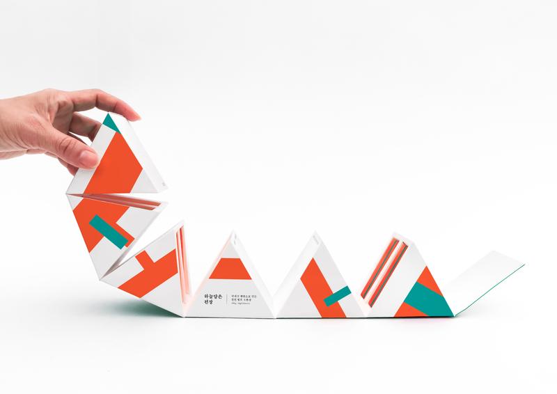
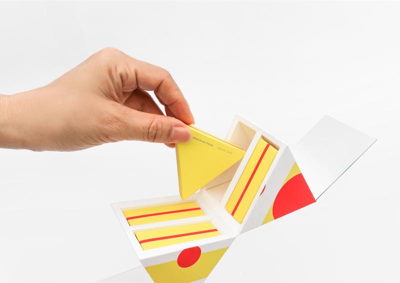
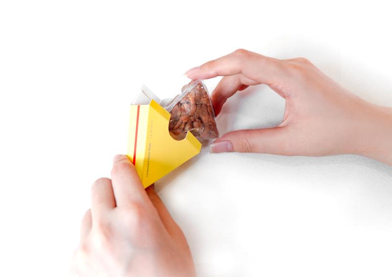
OROT mean 'This is perfect, without lacking'. As single-person households take up nearly 30% of the South Korean population. Most of People who live alone feed themselves by dining out and ordering food. Especially, the Korean food that is prepared with the traditional sauces of Korea is losing position just because it involves a lot of ingredients and the preparation is a complicated process. In addressing these issues, OROT has prepared single-serving packages of fermented sauces, which was previously sold mostly in large-sized packages. Fermentation begins in cracks. In the long 'time' of 1700, our field has been built with 'material' accumulated, mixed, and aged. Mold grows in the gaps between the ingredients, and over time, aging and fermentation progress. The morphological features of meju, beans, and peppers can be simplified into squares, circles, and triangles. It is selected as a graphic element and expresses the accumulation of time as repeated lines. The entire package was designed by creating individual patterns that repeat these basic shapes and lines. The gap of fermentation aged for a long time. As if the gap fits, it uses a package base structure that interlocks in one place. The triangular shaped sub-package inside allows easy storage.

